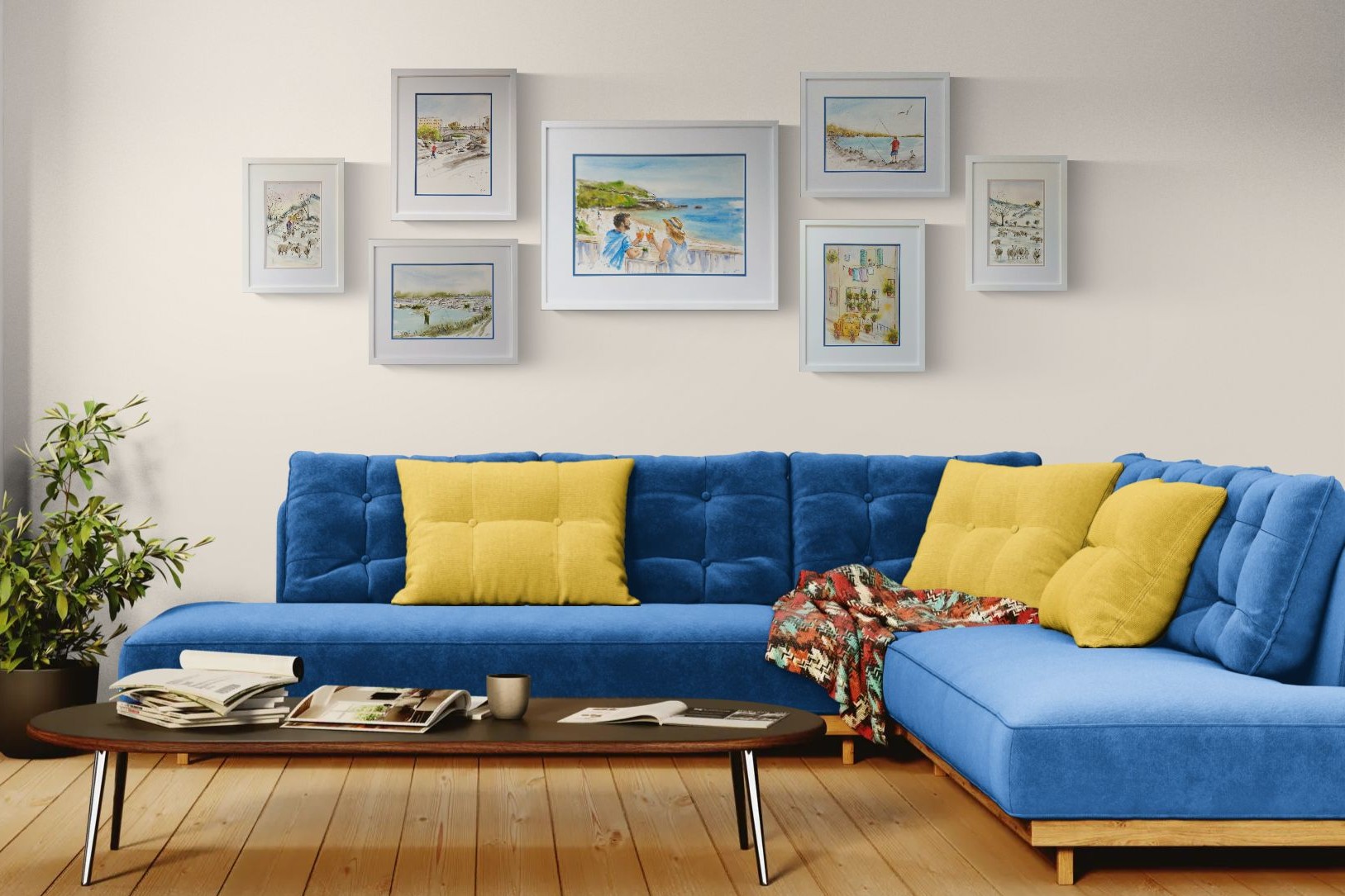
Why proportion beats formulas
Framing is a visual craft, and the most pleasing results come from proportion rather than a single 'correct' measurement. A mat that's generous relative to both the artwork and the moulding gives the eye somewhere to rest and makes even a modest print feel considered.
That said, a few time-tested systems give you a reliable starting point - and Framer's Bench builds each of them in so you can compare at a glance.
Equal borders - clean and neutral
Equal borders on all four sides are calm, modern and hard to get wrong. They suit contemporary work, photography and grid arrangements where consistency across many frames matters.
The one caveat: with equal borders, artwork can appear to float slightly low in the frame. If that bothers you, reach for a weighted bottom.
The weighted bottom - the gallery classic
Making the bottom border heavier than the top and sides is the signature of gallery and museum framing. A weighting factor of about 1.2-1.5 corrects the optical illusion that makes evenly-matted pieces look like they're sinking.
It's a small change that reads as 'professionally framed' to almost everyone, even if they can't say why.
Tip: Start with a bottom border about 1.3x the sides, then trust your eye. Taller artworks often benefit from a touch more weighting.
The golden ratio - proportion from nature
The golden ratio (roughly 1.618) has been used in art and architecture for centuries because it feels naturally balanced. Applied to framing, the bottom border is sized to the side border by that ratio for an elegant, deliberate proportion.
It's especially effective for fine-art prints, botanical studies and anything you want to feel timeless.
Colour, layers and restraint
Neutral mats age gracefully and keep attention on the artwork. Double and triple mats add depth and a fine accent line — a chance to echo a colour from the work without shouting.
Tip: The mat should support the image. If you notice the mat before the art, soften it or make the under-mat reveal smaller.